The short version
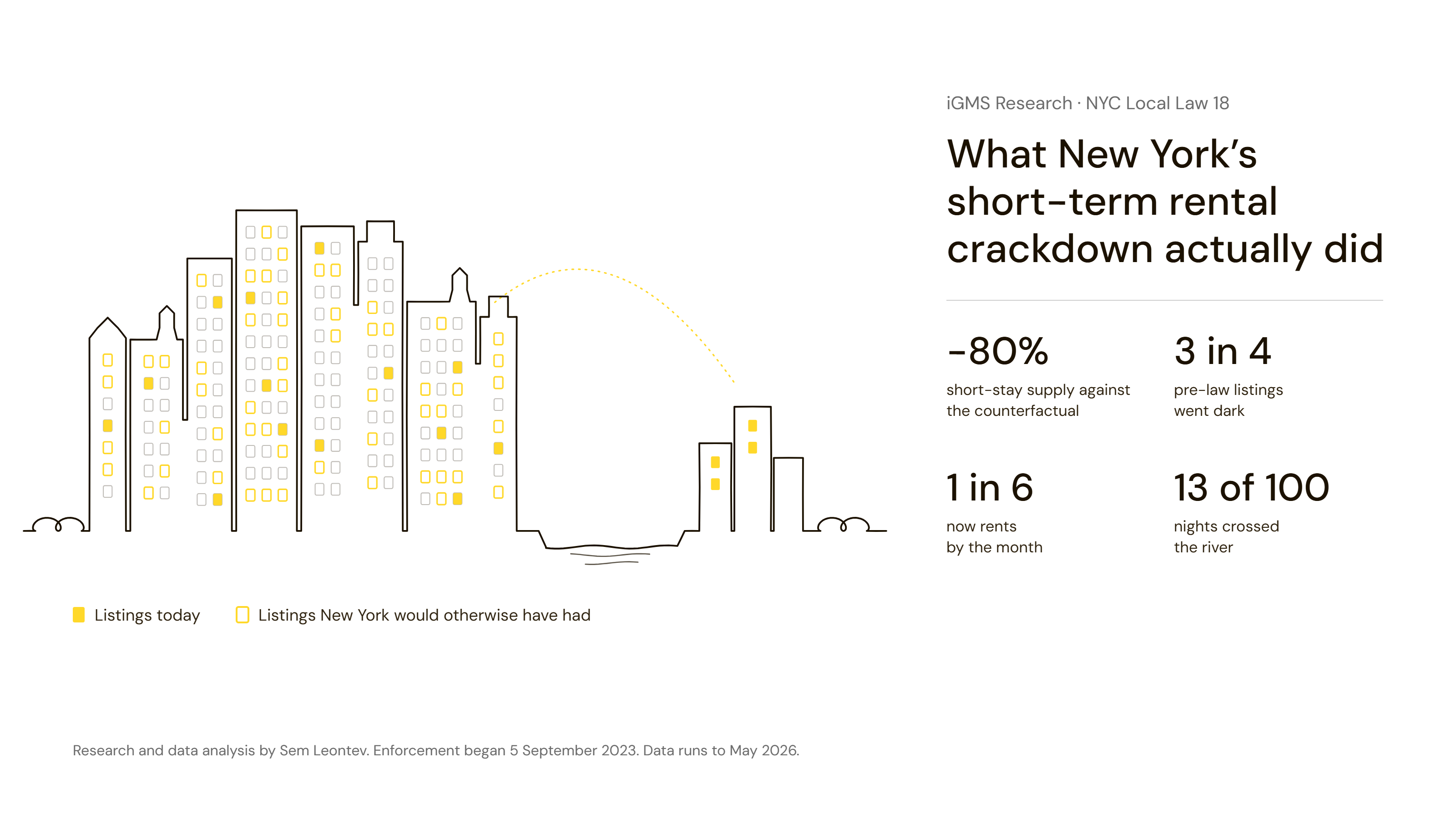
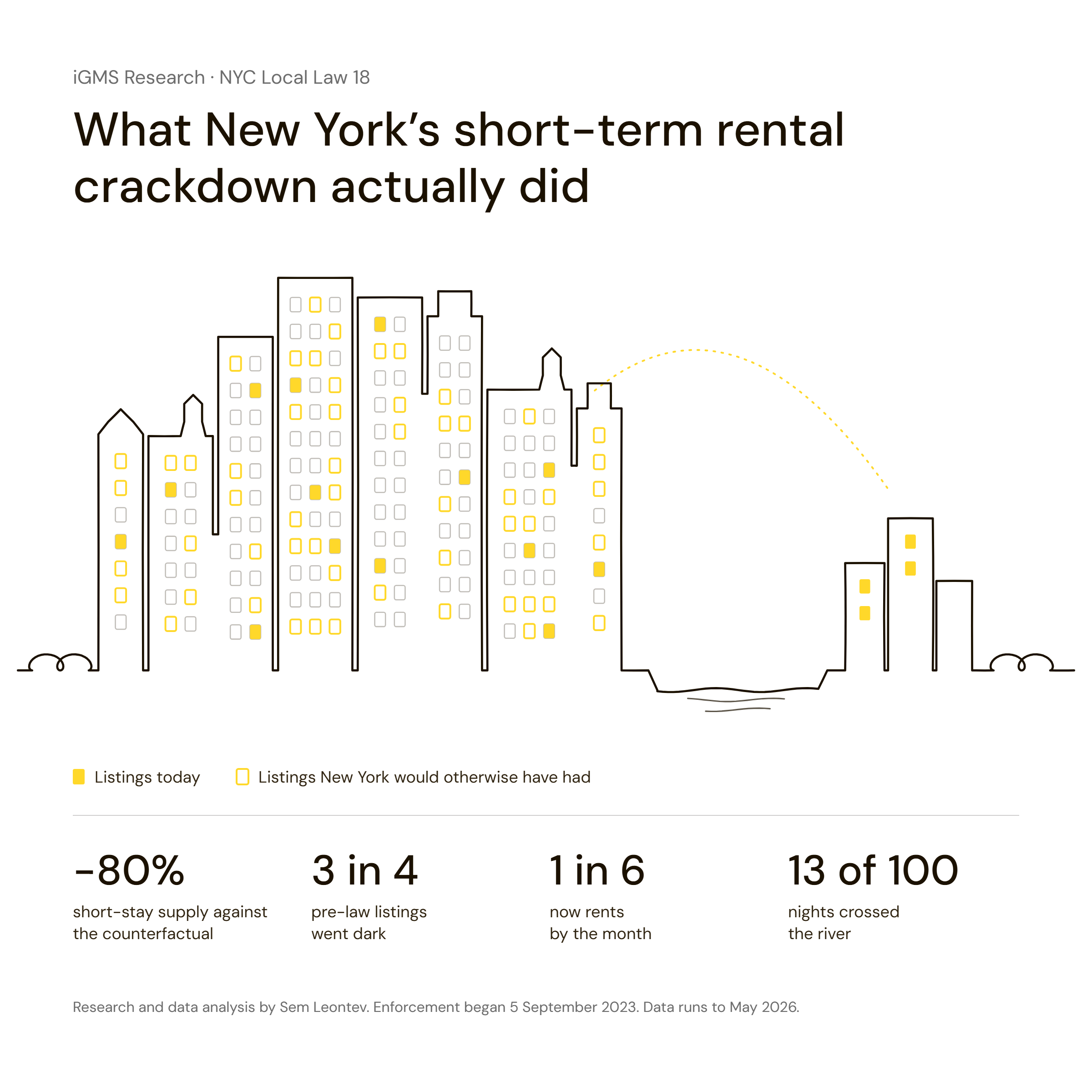
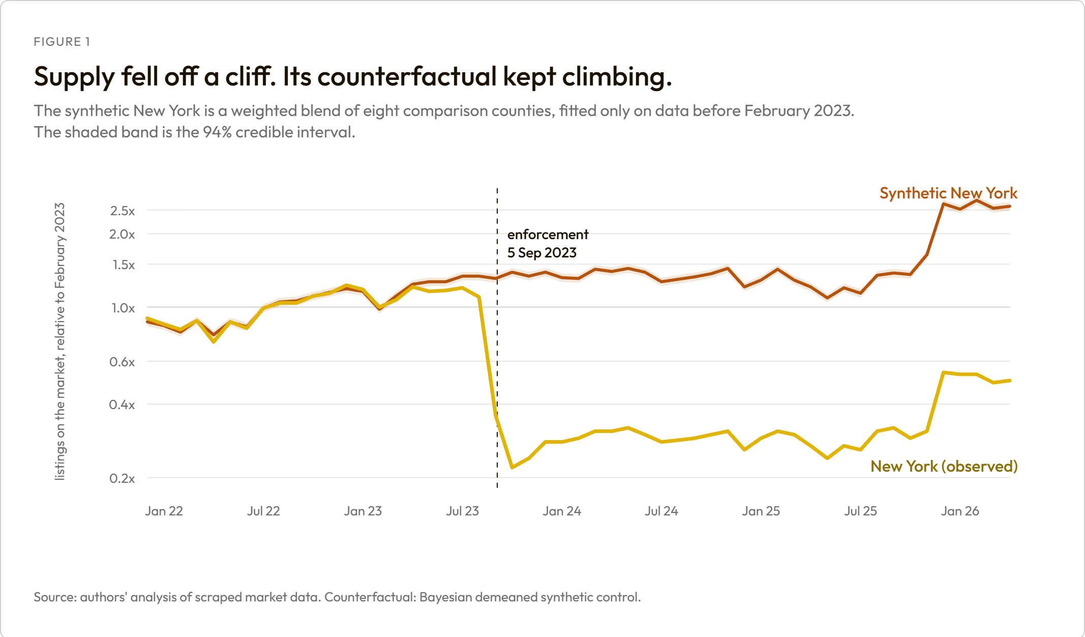
- Short-stay supply in New York City fell about 80% against what the city would otherwise have done, not the 72% you get from a simple before-and-after. Comparable markets grew 40% over the same months, so the raw fall understates the law rather than exaggerating it.
- The rebound everyone is writing about is real and it is not recovery from the law. Supply more than doubled from its trough, but comparable markets rose almost as much, so the gap barely closed: from 84% below the counterfactual to 81% below.
- Of the 31,198 listings that were active before the law, 76.5% are no longer visible on Airbnb and 17.4% converted to stays of 30 nights or longer. The largest block cannot be split cleanly, so we treat conversion as a floor and disappearance as a ceiling.
- Manhattan was not preserved. It kept more supply than any other borough while losing 81% of its own pre-law listings, the worst retention in the city. Roughly 72% of its current listings did not exist before the law.
- The law bit exactly where it was written to bite. Entire homes fell about 84% against comparable markets in the collapse window; private rooms fell about 75%. New York's home-to-room ratio inverted, from 1.26 entire homes per private room to 0.56.
- Roughly five-sixths of the asking-price rise is a change of mix, not hosts charging more. Asking prices rose 137% against comparable markets during the collapse. The same listings, tracked individually, rose 15%.
- Displaced demand crossed the river, and not much of it. For every hundred booked nights New York lost, the commuter ring picked up about thirteen. The gradient follows transit access almost perfectly.
Two things we deliberately do not claim: that the law raised surviving hosts' rates, and that any of those units returned to conventional housing. Both are set out in full below, because the reason we cannot claim them is itself a finding.
Three sets of numbers, none of which answer the question

Every party with a stake in Local Law 18 has published a figure, and the figures do not agree.
Airbnb says listings in New York City have declined by more than 90% since the law took effect, and pairs that with citywide average rents climbing 8.1% since 2023, hotel room rates up 12.6%, and a rental vacancy rate that moved half a point in the wrong direction. AirDNA, working from platform data, put the fall at 83% in the first year, alongside a 29% rise in long-term listings. The press has generally settled on "over 80%". The city's own Office of Special Enforcement counts from the enforcement side instead: roughly 60,000 illegal listings estimated in 2018, more than 38,000 active listings on a single platform at the start of 2023, and now a little over 3,000 granted host registrations, more than 4,300 denied applications, and over 21,000 units placed on the Prohibited Buildings List by their owners.
All of those numbers can be simultaneously true. They use different denominators, different windows, different definitions of a listing, and different data sources. That is the first problem.
The second problem is bigger, and it applies to every figure above. They are all before-and-after comparisons. A before-and-after is not an effect. It only becomes an effect if you are willing to assume that nothing else would have moved the market over the same period, and in this market something else clearly would have: comparable American counties with no new regulation grew their short-stay supply by 40.5% between the same two windows.
Run that arithmetic once, because it is the whole argument of this report:
New York, before vs after            -72.2%   the simple before-and-after
comparable markets, same months      +40.5%   what New York would have done
------------------------------------------------------------------------
effect against the counterfactual    -80.2%
A simple before-and-after understates the effect of the law by roughly 8 percentage points. Every figure in this report is measured against a modelled counterfactual New York rather than against New York's own past, which is why our supply figure, 80%, sits below Airbnb's 90% yet above New York's own before-and-after, and why we are far more conservative on prices.
1. The collapse, measured against a New York that never got the law
| Period | Effect vs counterfactual | 94% credible interval | Event-study cross-check |
|---|---|---|---|
| Mar to Aug 2023 (passed, not yet enforced) | -8.7% | -11% to -6% | -8.8% |
| Sep to Dec 2023 (the collapse) | -80.4% | -81% to -80% | -79.7% |
| 2024 (the rebound attempt) | -78.3% | -79% to -77% | -78.2% |
| 2025 to May 2026 (steady state) | -78.8% | -79% to -78% | -78.7% |
Three things in that table are worth pulling out.
The market started moving before enforcement did. Supply was already about 9% below its counterfactual in the window between the registration portal opening and the September deadline. It is a smaller move than the collapse, but it is a real one, and we estimated it rather than assuming it away. Anyone using early 2023 as a clean pre-period is measuring a market that had already begun to react.
The rebound is real, and it is not the law wearing off. New York's supply genuinely more than doubled from its October 2023 trough. It is the second half of that sentence that matters:
from the trough (Oct 2023) to May 2026:
New York's own supply rose      2.26x
the counterfactual rose         1.87x
------------------------------------------
the gap went from -84% to -81%
So a "New York Airbnb is bouncing back" headline is not wrong about the direction. It is wrong about the cause. The market recovered. The effect of the law did not go away.
The steady state is a steady state. Three years in, the shortfall has settled between 78% and 79% and stopped moving. Whatever adjustment was going to happen has largely happened.
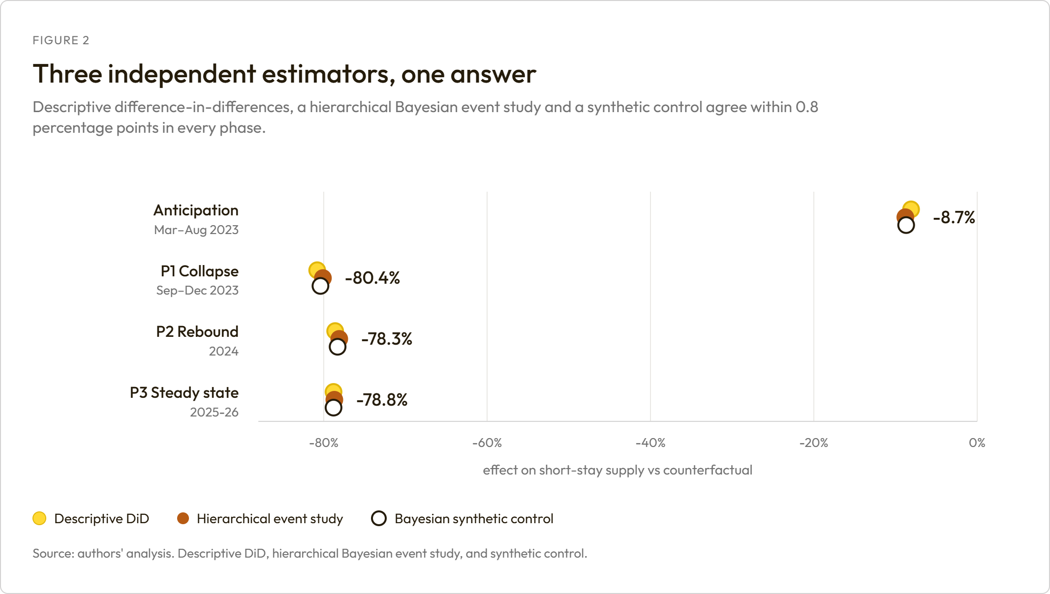
We ran a difference-in-differences that weights all eight comparison markets equally, a hierarchical Bayesian event study that estimates a common monthly path from all eight jointly and reads New York's departure from it, and a synthetic control that picks weights so a composite tracks New York before the law. A badly chosen comparison group would move the first and third together and leave the second alone. A seasonality error would move the second alone. They agree within 0.8 percentage points in every period.
2. Where the listings went

This section is a count, traced listing by listing against a public snapshot of Airbnb from March 2026. No causal claim is attached to any number in it.
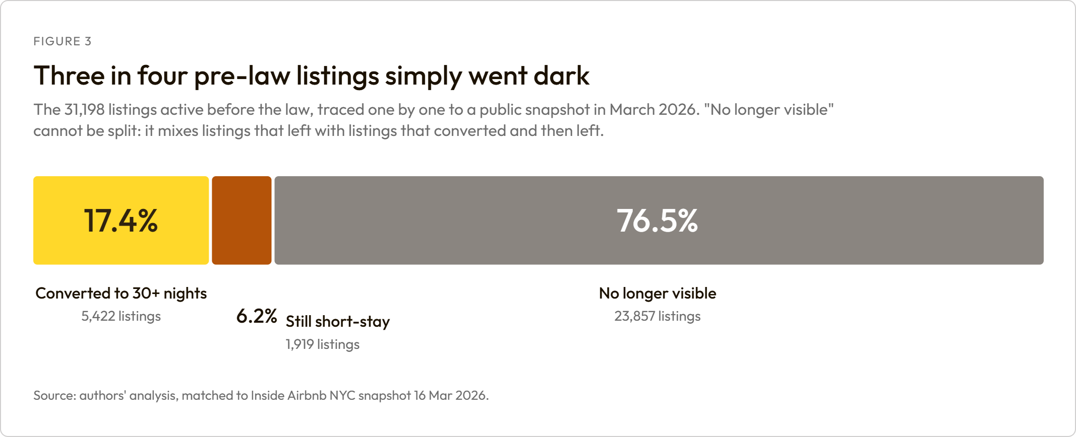
| Outcome for pre-law listings | Listings | Share |
|---|---|---|
| No longer visible | 23,857 | 76.5% |
| Converted to stays of 30 nights or more | 5,422 | 17.4% |
| Still selling short stays | 1,919 | 6.2% |
The largest block cannot be split, and we do not split it. A listing that moved to 30-night minimums in 2023 and then left the platform in 2024 looks identical to one that left outright in 2023. So the conversion share is a floor and the disappearance share is a ceiling. Anyone quoting a single "units removed" figure is asserting something this data cannot support, and that includes us.
What we can say precisely, and it is the more interesting number anyway: of the pre-law listings still visible today, roughly three in four now require a stay of a month or longer. That is not a short-term rental. It is also not conventional housing. It is a third category that most of the published analysis of this law does not have a column for.
What "no longer visible" does not mean
It means not found in a public snapshot of Airbnb taken in March 2026. Four other things produce that same observation, and two of them we can size.
| What it could be | Can we size it? |
|---|---|
| The listing genuinely left Airbnb | The residual |
| The snapshot did not capture it | Yes. It misses about 9% of listings we can independently see transacting |
| It vanished from one snapshot and came back | Yes. About one disappearance in ten is temporary |
| It was relisted under a new listing id | No |
| It moved to another platform | No. We hold no Vrbo or Booking data |
Adjusting for snapshot coverage, roughly 74% of the pre-law cohort is genuinely absent from Airbnb, against the 76.5% observed.
Here is the honest ladder of claims, in descending order of how far each can be pushed:
- "76.5% are no longer visible in the March 2026 snapshot" is exactly true.
- "About 74% are genuinely absent from Airbnb" is defensible.
- "76% left the short-term rental market" is not established. Other platforms are invisible to us.
- "Those units returned to housing" is not established, and not testable with this data at all.
That last line is the one we expect to be misquoted, so it is worth being blunt about why. We hold no deeds, no sale prices, no owner identities, and no way to tell whether a listing is owner-occupied. A listing leaving Airbnb is consistent with a unit returning to the long-term market, and equally consistent with a second home sitting empty, a unit moving to another platform, or a host switching to 30-night stays and then giving up. Nothing in listing data separates those. Both sides of this argument have made that leap in public. We are not going to.
Why this section needs two datasets
our own transaction data  ->   5.5% of the cohort still sells SHORT stays
Inside Airbnb snapshot    ->  24.7% of the cohort is still listed on Airbnb AT ALL
---------------------------------------------------------------------------
the gap                   ->  19.1% are still on Airbnb, no longer selling short stays
                             = the conversion channel
Our own data is built from listings offering stays of under a week, so a listing that switches to 30-night minimums vanishes from it and looks exactly like an exit. The public snapshot sees every listing regardless of minimum stay, but cannot see what actually transacts. Neither source alone can separate conversion from exit. The difference between them is what makes this section possible, and it is the single biggest reason our picture differs from analyses built on one feed.
3. Manhattan was not preserved, it was replaced

Manhattan held on to more short-stay supply than any other borough. It is tempting to read that as Manhattan's listings having survived. The opposite happened.
| Borough | Supply kept (collapse) | Pre-law listings that survived | Current listings that are new |
|---|---|---|---|
| Manhattan | -47.6% | 19.1% | 72.5% |
| Staten Island | -82.5% | 31.6% | 65.2% |
| Queens | -83.8% | 23.9% | 64.2% |
| Brooklyn | -84.2% | 27.5% | 58.7% |
| Bronx | -86.5% | 24.4% | 66.0% |
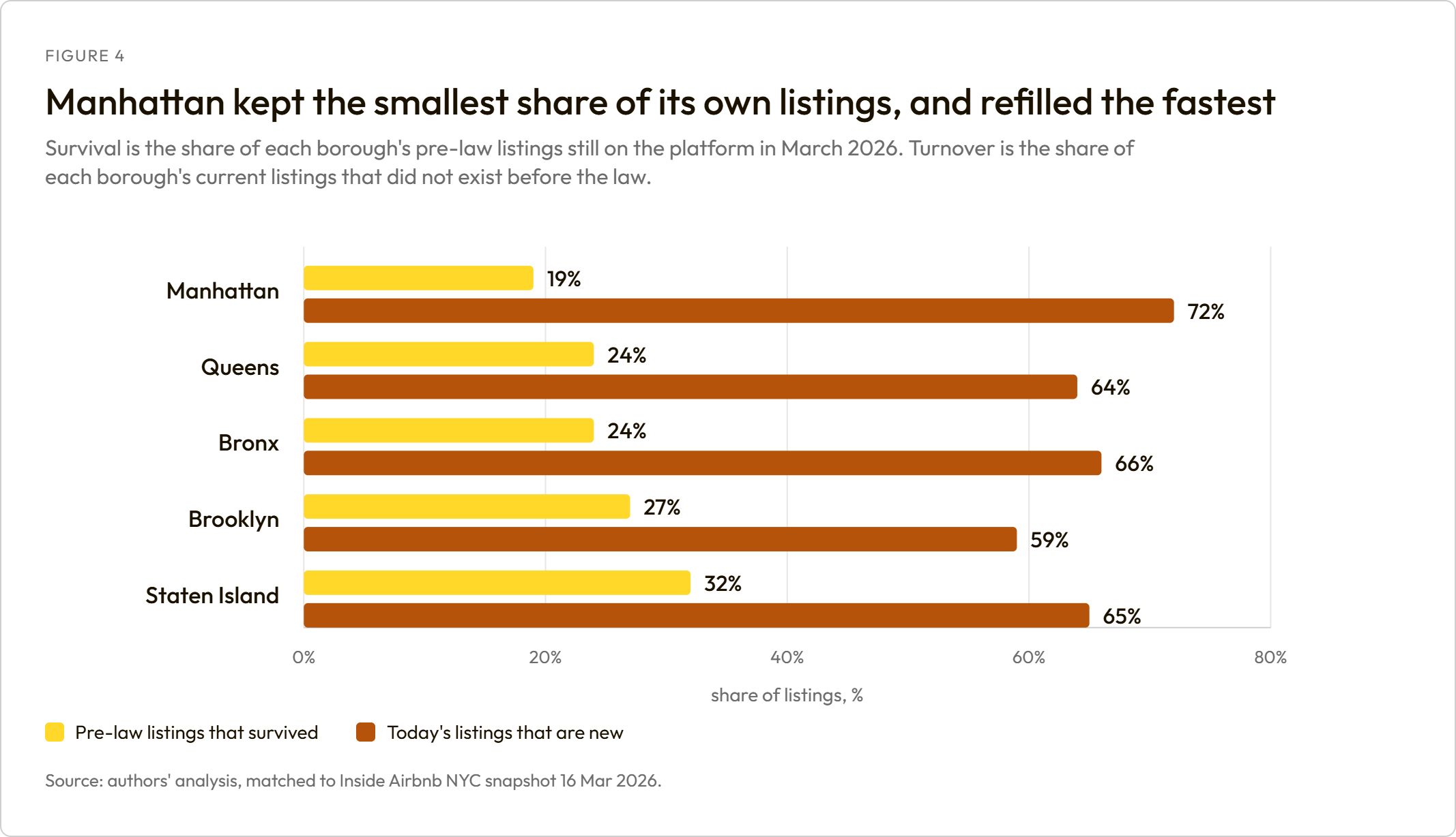
Manhattan ranks first on supply retained and last on listings retained. It lost 81% of its own pre-law listings, more than any other borough, while losing the least supply. Both are true because the supply came from somewhere else: 72% of Manhattan's current listings did not exist before the law. The borough's short-stay market was cleared and then repopulated.
One caution on that 72%, because it is easy to over-read. Listings churn constantly on this platform, law or no law:
| Market group | Listings active now | Share new since the law |
|---|---|---|
| New York boroughs | 6,363 | 67% |
| The commuter ring | 16,112 | 80% |
| Comparison markets, no law | 32,940 | 74% |
Comparison markets with no regulation at all replaced about the same share of their listings. So the speed of the replacement is not the finding. What moved in is.
| Where | Origin | Claims exemption | Neither recorded | Registered | Listings |
|---|---|---|---|---|---|
| Manhattan | Listed before the law | 83.7% | 0.0% | 16.3% | 886 |
| Manhattan | New since the law | 70.7% | 23.5% | 5.7% | 2,099 |
| Outer boroughs | Listed before the law | 12.2% | 0.1% | 87.7% | 1,033 |
| Outer boroughs | New since the law | 21.2% | 5.9% | 72.9% | 1,470 |
The two halves of the city responded to the same law in opposite ways.
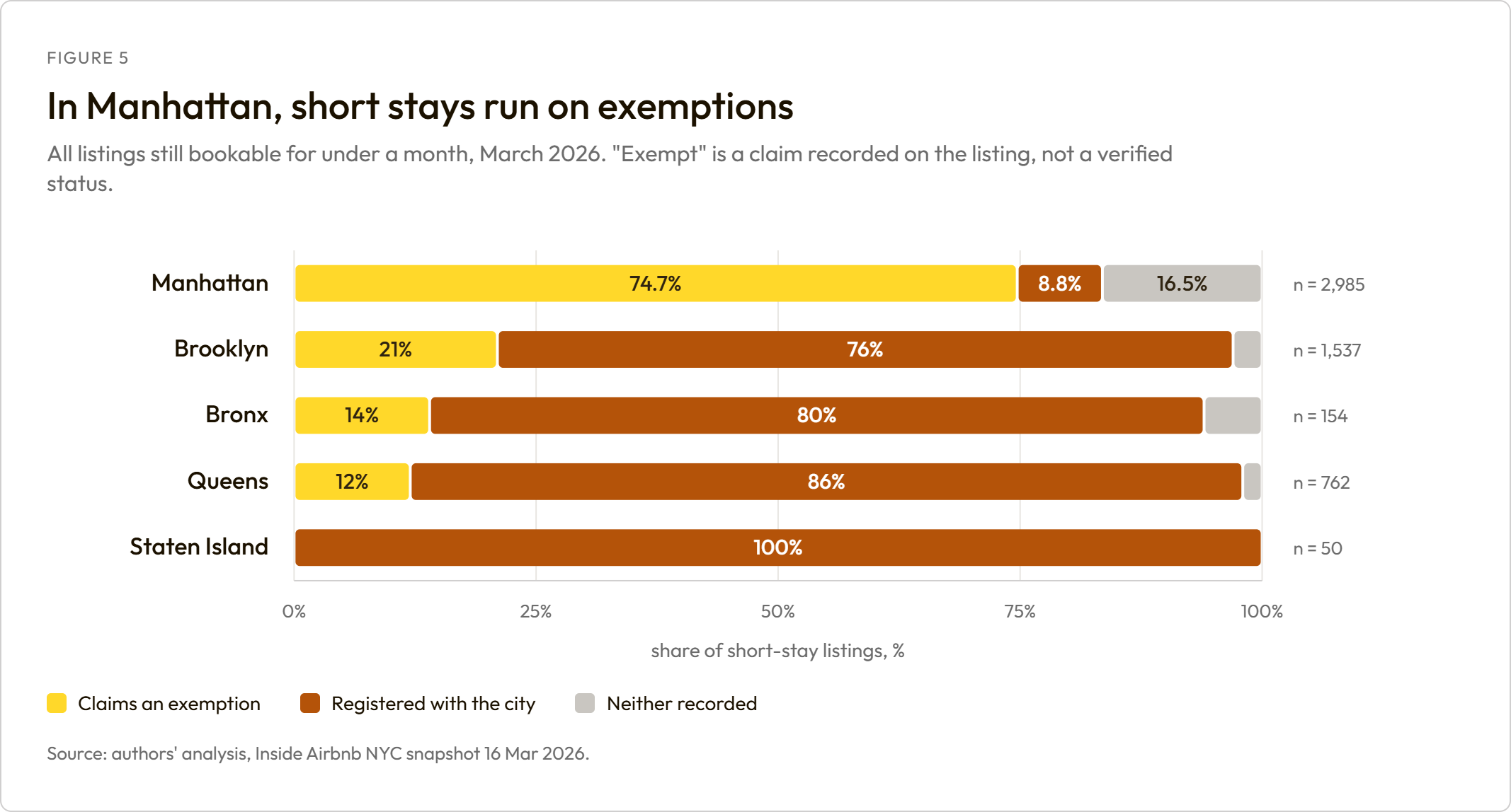
In the outer boroughs, the listings that moved in are registered residents, which is the home-sharing Local Law 18 was written to permit. In Manhattan, the listings that moved in claim an exemption (71%) or record nothing at all (24%). Fewer than one in sixteen is registered.
Across the whole short-stay population, Manhattan runs 75% exemption-claiming against 21% in Brooklyn and 12% in Queens. Among pre-law survivors alone the Manhattan figure is higher still at 84%, but the whole-population number is the one to quote because it rests on three times as many listings.
The "neither recorded" category is the one to watch. It is essentially absent among listings that predate the law and accounts for roughly a quarter of Manhattan's new short-stay stock: listings offering short stays with neither a registration nor an exemption claim against their name.
The caveat here is load-bearing. An exemption claim is an assertion recorded on a listing, not a status anyone has confirmed. The correct reading of that 75% is what hosts assert, and the size of the gap between Manhattan and everywhere else is why it matters. What replaced Manhattan's home-sharing stock is, on the platform's own record, mostly a class of accommodation claiming to sit outside the law rather than inside it.
4. The law bit exactly where it was written to bite

This is the strongest test in the report, and it is the one that does not depend on any comparison city at all.
Local Law 18 requires the host to be present. An entire home cannot satisfy that. A private room with a resident host can. So if what we are measuring is the law rather than something else happening in New York, entire homes should fall further than private rooms within the same city, in the same months.
They do, by a wide margin, and New York's move is the largest of any market we looked at:
| Period | New York | Comparison average | Difference | NYC rank |
|---|---|---|---|---|
| Sep to Dec 2023 (collapse) | -0.354 | +0.061 | -0.415 | 1 of 9 |
| 2024 | -0.640 | +0.100 | -0.740 | 1 of 9 |
| 2025 to May 2026 (steady state) | -0.803 | +0.140 | -0.943 | 1 of 9 |
(Change in the log ratio of entire homes to private rooms.) In the collapse period New York sits 4.6 standard deviations from the comparison-market average.
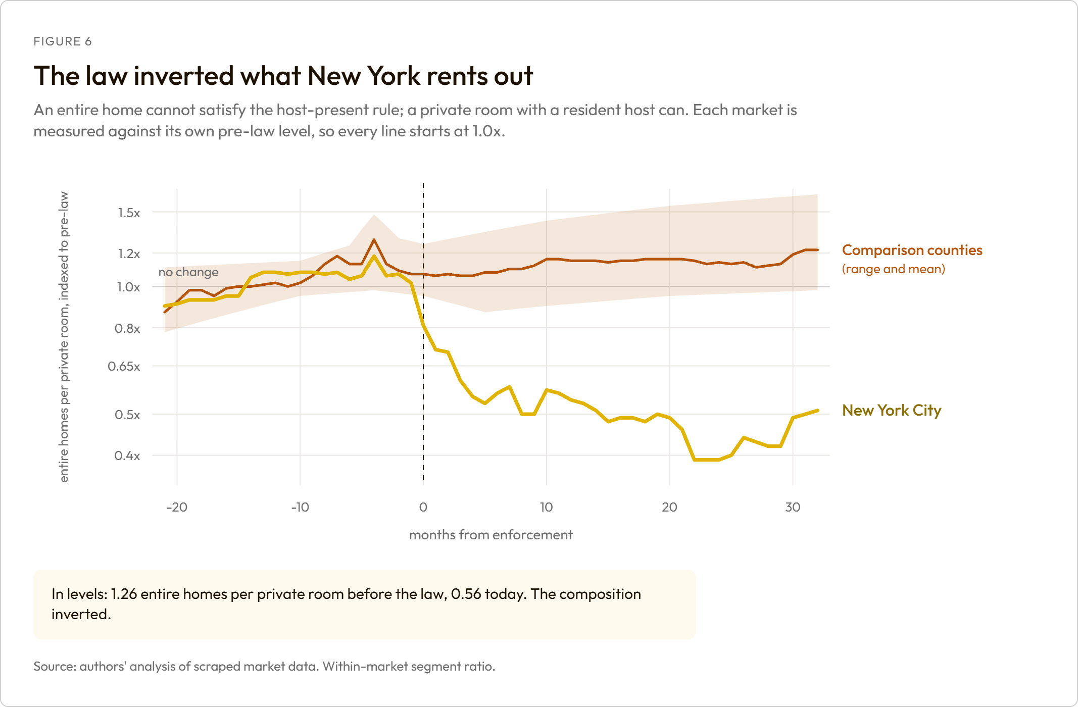
This test holds "being in New York" constant. Both segments sit in the same city, so a citywide shock, whether tourism, return-to-office, or a national travel trend, moves both and cancels out. That is why we lean on it hardest.
How to read that chart, because it is easy to misread. The line is a ratio between two segments, not the size of either one. Each market is indexed to its own pre-law level, so every line starts at 1.0x. New York sitting near 0.5x means its entire-home-to-private-room ratio is about half of what it was. It does not mean entire homes are half the size of private rooms, and it does not mean entire homes fell 50% further than private rooms.
In actual counts, the ratio went from 1.26 entire homes per private room before the law to 0.56 today. New York used to offer more entire homes than private rooms. It now offers fewer. The composition inverted.
Measured separately against comparable markets, both segments collapsed:
| Period | Entire homes vs comparison markets | Private rooms vs comparison markets | Ratio between them, net of those markets |
|---|---|---|---|
| Sep to Dec 2023 (collapse) | -84% | -75% | 0.66x |
| 2025 to May 2026 (steady state) | -87% | -67% | 0.38x |
One thing this does not say: private rooms were not spared. They fell roughly 75% against comparable markets in the collapse window, against 84% for entire homes. The law removed the short-stay market broadly, and the compliance margin explains a further ten points on top of that. Anyone reading this table as "private rooms were fine" has it backwards. The host-present rule shaped which listings died first. It did not create a protected category.
5. The price rise is mostly a change of mix
There are two ways to measure what happened to prices, and the gap between them is this entire section.
The average asking price. Add up what every listing asks and take the middle. This is the number that gets quoted. It moves when the mix of listings changes even if no host ever touches a price, because when the cheap listings disappear the average rises on its own.
What the same listings did. Follow each individual listing month to month and record only its own price changes. A listing that vanishes contributes nothing after it leaves. Composition cannot move this measure.
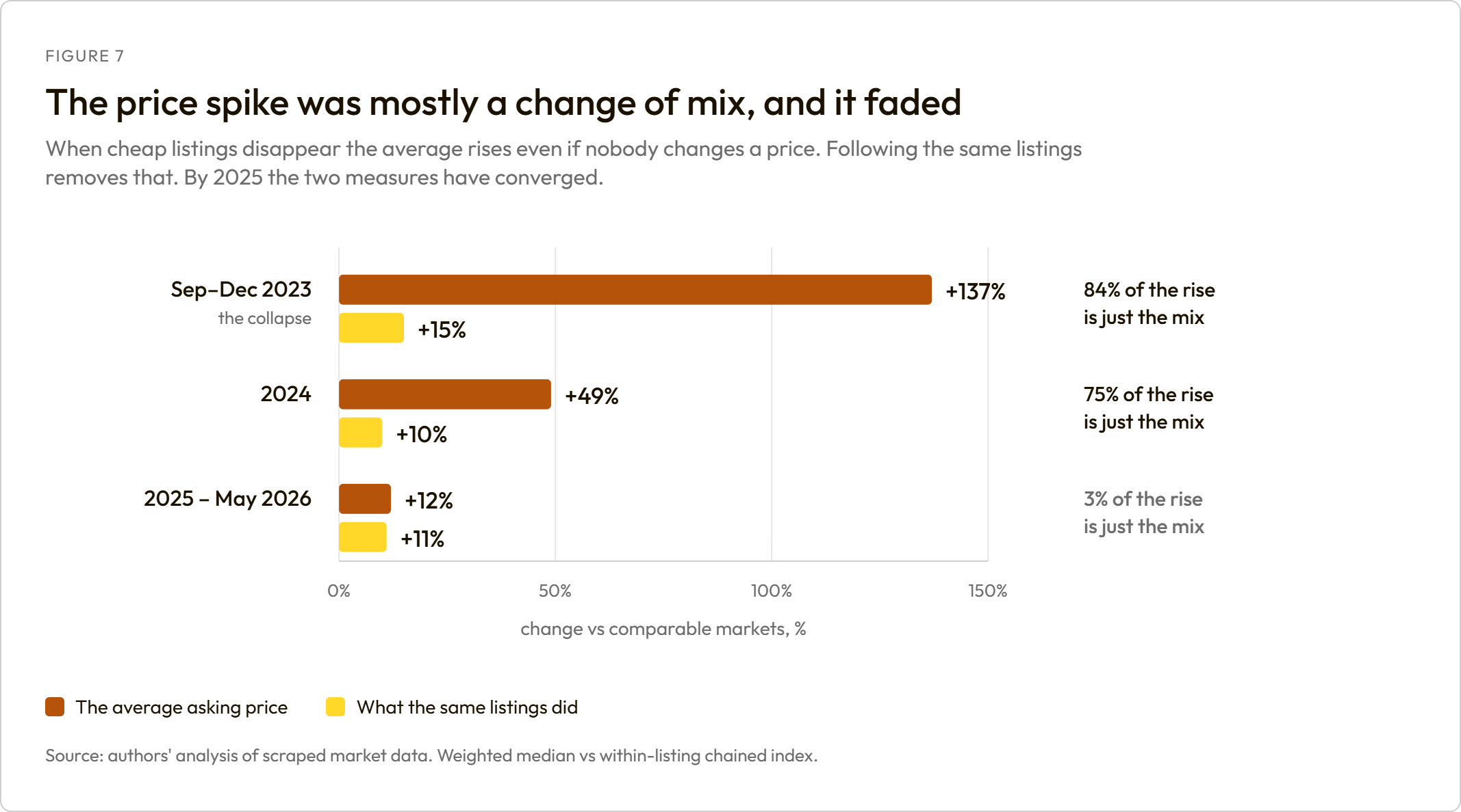
| Period | Average asking price vs comparable markets | What the same listings did | Share that is just the mix |
|---|---|---|---|
| Sep to Dec 2023 (collapse) | +137% | +15% | 84% |
| 2024 | +49% | +10% | 75% |
| 2025 to May 2026 | +12% | +11% | 3% |
Roughly five-sixths of the apparent price rise during the collapse was the mix changing, not hosts charging more.
And the distortion fades. By 2025 the two measures have converged. Once the stock stops churning, the average asking price stops lying. That has a practical implication for anyone reading price claims about this law: composition bias is largest exactly during the window most analyses measure. A study of the first six months, using average asking prices, will attribute to the law something that is mostly the arithmetic of a shrinking sample.
Did the law cause the rest of the rise? Four tests, one failure
We ran four tests on prices, and the same four on booked nights so the two could be compared directly.
- Compare New York with the comparison markets, before against after, assuming nothing else was drifting.
- The same comparison, after first removing any straight-line drift already running between them.
- Pretend the law arrived in January 2023, when nothing happened, using only data from before the real law. A design that finds an effect here is broken. This is a test of the method, not of the law.
- Ask whether New York's prices were already pulling away before the law.
| Test | Price | Booked nights |
|---|---|---|
| 1. Before vs after | +9.6%, real | -76.2%, real |
| 2. Removing a drift | +4.6%, real | -70.7%, real |
| 3. Fake date, want nothing | +5.7%, real | -0.4%, could be zero |
| 4. Already drifting, a year out | +9.0%, real | +1.4%, could be zero |
Test 3 as a share of test 1, the diagnostic that decides this section:

PRICE           61%   the fake date reproduces most of the 'effect'  -> FAILS
BOOKED NIGHTS    0%   the fake date finds nothing                    -> PASSES
Read across the rows. Tests 1 and 2 find a price rise. Test 3 is where price and quantity separate: on prices, a fake treatment date reproduces most of the "effect"; on booked nights it finds essentially nothing. Test 4 explains why. New York's asking prices were already pulling away from comparable markets at roughly 9% a year before the law arrived. Its booked nights were not.
So the price design fails a test the quantity design passes comfortably. That asymmetry is the reason this report makes a strong claim about supply and no causal claim at all about prices.
The numbers we will stand behind, and the one we will not:
| Claim | Status |
|---|---|
| "Most of the asking-price rise is a change of mix" | The finding. It does not depend on the failed test |
| "Surviving hosts' asking rates rose about 15%" | The measured figure, but not attributable to the law |
| "The law raised prices by X%" | We do not make this claim. The causal test fails |
We could publish a price effect. It would look defensible, it would be quotable, and it would be the exact error this report exists to correct.
6. Demand crossed the river, and only a little of it

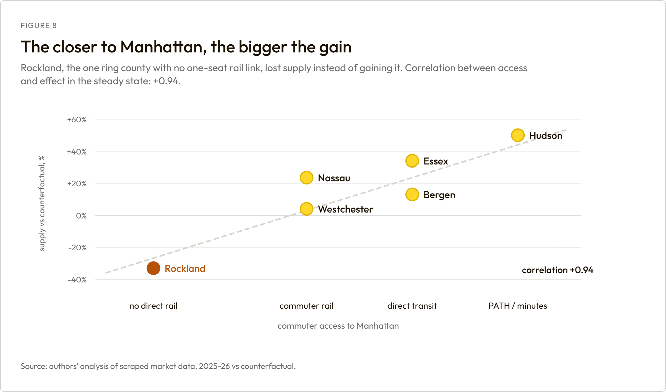
| County | Commuter access | Collapse | Steady state |
|---|---|---|---|
| Hudson NJ | 5 | +11.9% | +50.0% |
| Bergen NJ | 4 | -2.2% | +12.5% |
| Essex NJ | 4 | +19.1% | +33.8% |
| Westchester NY | 3 | -4.4% | +4.2% |
| Nassau NY | 3 | +2.6% | +23.3% |
| Rockland NY | 1 | -21.7% | -33.1% |
The correlation between commuter access and the effect is +0.94. The counties closest to Manhattan by transit gained the most, and Rockland, the one ring county with no one-seat rail link, lost supply instead of gaining it. That ordering is what makes this displacement rather than coincidence. A general regional boom would not sort itself by PATH access.
Now the size of it, which is the part that gets left out:
| Period | Nights New York lost vs counterfactual | Nights the ring gained | Per 100 nights lost, the ring gained |
|---|---|---|---|
| Sep to Dec 2023 | 662,975 | 82,736 | 12 |
| 2024 | 2,346,052 | 292,377 | 12 |
| 2025 to May 2026 | 3,362,361 | 449,895 | 13 |
For every hundred booked nights New York lost, the surrounding counties picked up around thirteen, and that ratio is stable across every period we measured. Because conversion to 30-night stays also leaves our quantity series, thirteen is a lower bound on diversion rather than a point estimate. It is still nowhere near a hundred.
And what grew in the ring was breadth, not intensity:
| Period | Listings per month | Booked nights per month | Nights per listing |
|---|---|---|---|
| Before the law | 3,883 | 53,504 | 13.8 |
| 2025 to May 2026 | 7,445 | 108,362 | 14.6 |
The ring roughly doubled its listing count while nights per listing barely moved, from 13.8 to 14.6. The growth is more properties being listed, not existing hosts selling more nights.
What this does not show
We measured listings and booked nights. We have no data on property transactions: no deeds, no sale prices, no owner identities, and no way to tell whether a listing is owner-occupied. So one reading in particular is not supported by this analysis:
"Investors are buying property in the surrounding counties."
A newly listed property in Hudson County could be an owner deciding to list a home they already had, a long-term rental being converted, a second home coming onto the market, or an investment purchase. We cannot distinguish these, and listing data contains nothing that would let us. Anyone who wants that claim needs transaction records, which are a different dataset and a different study.
So where did the other 87 nights go?
This is the open question, and it is worth stating plainly rather than papering over.
Published research on the same law, by Anastasi, Marsella, Melo, Stephenson and Wagner in the European Journal of Political Economy (2025), finds that hotels captured the price benefit rather than the volume: average daily rates up about $14.43 a night, roughly 5.6%, and occupancy effects that were small and imprecise. In room-nights, hotels absorbed on the order of one percent more, which was not statistically distinguishable from zero.
Add the commuter ring's thirteen percent and the hotel sector's roughly nothing, and the overwhelming majority of those booked nights did not reappear anywhere we can observe. Two explanations survive and this data cannot separate them: the trips did not happen, or they moved into the 30-night-plus market, which is the same market our own listing trace shows absorbed a large share of the supply. We think the second deserves far more attention than it has had, and we cannot prove it.
What we could not answer
Reported because the gaps matter, and because the temptation to fill them is where most analysis of this law goes wrong.
How price-sensitive demand is. An 80% supply cut with no cleanly attributable price response ought to be a natural experiment in demand elasticity. It is not, for two independent reasons. Our measure of quantity is censored by the same law, because a listing that converts to 30-night minimums leaves the quantity series exactly as it leaves the supply series, so the observed fall mixes demand with conversion. And the price side failed its fake-date test, so the input the calculation needs is itself unreliable. We can produce a number. We do not believe it.
Whether the law helped renters. Out of scope here, deliberately. It is the hardest question in this area. A National Bureau of Economic Research team studying Chicago's equivalent ordinance could not reach it with better data than ours. We would rather leave it open than answer it badly, and we note that both Airbnb's rent figures and the city's enforcement counts are routinely presented as if it had been settled.
Whether high-Airbnb neighbourhoods changed more than others. We tested it. The estimate is too imprecise to distinguish the effect we would expect from no effect at all, so it supports nothing in either direction.
How this was measured, in one paragraph
Every effect in this report is measured against a modelled counterfactual New York built from eight comparison counties, using three methods that fail in different ways and agree anyway. Every count is traced to a published snapshot. The designs were tested by re-running the whole analysis on 19 markets where no law passed, by removing each comparison market in turn, and by pretending the law arrived on a date when nothing happened, which is the test the price design fails. The full method, the diagnostics and the definitions are in the appendix, written so they can be read on their own.
What to watch next
Three things would move these numbers, and all three are live.
Int 0879-2026. Introduced on 30 April 2026 with 45 co-sponsors and pending before the Council's Committee on Housing and Buildings, it would let owner-occupants of one- and two-family homes host up to four guests and, critically, host while absent. That last provision goes directly at the host-present rule, which section 4 shows is the margin doing the work. If it passes, the outer-borough registered-resident segment is where the response should appear first.
The "neither recorded" segment in Manhattan. A quarter of Manhattan's new short-stay stock carries neither a registration nor an exemption claim. Either enforcement reaches it or it becomes the market's new normal, and the two paths look very different in the data within a couple of quarters.
The 30-night-plus market. It absorbed a large share of the supply, it sits outside almost every published analysis of this law, and it is where our best remaining guess about the missing booked nights points. It is also the obvious next study, and the one we are best placed to run.
Appendix: methodology
Research and data analysis by Sem Leontev. This appendix is written to stand on its own, so anyone who wants to check the report can work from this section alone.

A1. Data
Two independent sources, with different blind spots. That difference is load-bearing rather than incidental, and section 2 of the report depends on it.
- Transaction data. Our own scraped market data, covering listings offering stays of under a week and the nights they actually sell. A listing that moves to a 30-night minimum leaves this dataset entirely, which looks identical to leaving the platform.
- Public snapshots. Inside Airbnb snapshots of New York City, four in total, with the March 2026 snapshot (16 March 2026) used as the reference for the listing trace. These see every listing regardless of minimum stay, but cannot see what transacts.
- Levels come from public sources and effects come from our modelling. Where a figure is a count of listings, it is traceable to a published snapshot.
A2. Periods
The law passed in 2022, the registration portal opened in 2023, and enforcement began on 5 September 2023. Because the market began reacting between the portal opening and the deadline, we estimated the anticipation window rather than treating early 2023 as a clean pre-period.
| Label | Window | What it covers |
|---|---|---|
| Anticipation | Mar to Aug 2023 | Law passed, registration open, enforcement not yet begun |
| P1, the collapse | Sep to Dec 2023 | The first four months of enforcement |
| P2, the rebound attempt | 2024 | The recovery in absolute listings |
| P3, steady state | 2025 to May 2026 | Where the market has settled |
A3. Comparison markets
Eight U.S. counties, screened three times: for their own short-term-rental regulation, for whether they tracked New York's pre-enforcement path, and for gaps in how they were measured.
We started from 62 candidate markets rather than the 14 originally planned, because New York is large enough that a credible synthetic control needs a deep donor pool. Washington DC was dropped because its own regulation was already reshaping its market, which would have contaminated the counterfactual.
The commuter ring is deliberately excluded from the control group. It is where displaced demand goes, which makes it an outcome rather than a control. Using it as a comparison market would net out part of the effect we are trying to measure.
A4. The counterfactual: three estimators
All figures quoted as effects are against the modelled counterfactual, not against New York's own past. Three methods run in parallel:
- Difference-in-differences, weighting all eight comparison markets equally.
- A hierarchical Bayesian event study, estimating a common monthly path from all eight jointly and reading New York's departure from it.
- A Bayesian demeaned synthetic control, choosing weights so a composite tracks New York before the law, fitted only on data from before February 2023.
The three fail in different ways, which is what makes their agreement informative rather than circular. A poorly chosen comparison group would move the first and third together while leaving the second alone. A seasonality error would move the second alone. They agree within 0.8 percentage points in every period (Figure 2).
A5. Tracing the pre-law listings
The 31,198 listings active before the law were matched one by one to the March 2026 public snapshot and sorted into three outcomes: still selling short stays, converted to stays of 30 nights or more, and no longer visible.
Why conversion is a floor and disappearance is a ceiling. A listing that moved to 30-night minimums in 2023 and then left the platform in 2024 is indistinguishable from one that left outright in 2023. Both appear as "no longer visible". Nothing in either dataset separates them, so we report the conversion share as a lower bound and the disappearance share as an upper bound, and we do not publish a single "units removed" figure.
Coverage adjustment. The snapshot lists 90.6% of the listings we can independently see transacting, so it misses roughly 9% of live listings. About one disappearance in ten proves temporary across the four snapshots: 23.5% of the pre-law cohort appears in the March snapshot alone, against 24.7% in any of the four. Adjusting for that, roughly 74% of the cohort is genuinely absent from Airbnb, against the 76.5% observed.
The two-source gap. Our transaction data shows 5.5% of the cohort still selling short stays. The snapshot shows 24.7% still listed at all. The 19.1-point difference is the conversion channel, and neither source alone can measure it.
A6. The segment test
Local Law 18 requires the host to be present, which an entire home cannot satisfy and a private room with a resident host can. If what we are measuring is the law rather than a citywide shock, entire homes should fall further than private rooms within the same city and the same months.
We measure the log ratio of entire homes to private rooms inside each market, indexed to each market's own pre-law level. New York's ratio moved further than every comparison market in every period, ranking first of nine each time, and sits 4.6 standard deviations from the comparison-market average in the collapse window.
This test is the strongest thing in the report because it holds "being in New York" constant. Tourism, return-to-office patterns and national travel trends move both segments and cancel out.
A7. Measuring prices
Two measures, deliberately:
- The average asking price, as a weighted median across listings. This moves when the mix of listings changes, even if no host touches a price.
- A within-listing chained index, following each listing month to month and recording only its own price changes. A listing that vanishes contributes nothing after it leaves, so composition cannot move this measure.
The gap between them is the composition finding in section 5.
Four tests, run on prices and on booked nights so the two can be compared directly:
- New York against the comparison markets, before versus after, assuming nothing else was drifting.
- The same comparison after removing any straight-line drift already running between them.
- A fake treatment date of January 2023, when nothing happened, using only data from before the real law. A design that finds an effect here is broken.
- Whether New York's prices were already pulling away before the law.
Test 3 as a share of test 1 is the diagnostic that decides the section: 61% on prices, which fails, and 0% on booked nights, which passes. Test 4 explains the asymmetry. New York's asking prices were already drifting up at roughly 9% a year relative to the comparison markets before the law arrived, and its booked nights were not. We therefore make no causal price claim anywhere in this report. The composition finding does not depend on the failed test.
A8. Measuring diversion
Six commuter-ring counties, each scored 1 to 5 for commuter access to Manhattan, from no direct rail (Rockland) to PATH access measured in minutes (Hudson). Each county is measured against its own counterfactual on the same basis as New York.
The correlation between access and effect is +0.94 in the steady state.
The diversion ratio divides the nights the ring gained by the nights New York lost against its counterfactual, per period. It is a lower bound, for the same reason the supply series is censored: a New York listing that converts to 30-night stays leaves our quantity series exactly as it leaves our supply series, so the denominator captures conversion as well as lost demand.
A9. Robustness and diagnostics
We ran these whether or not they were flattering.
Placebo testing. New York is a single treated market, so conventional inference does not apply. Instead we re-ran the entire analysis 19 more times, each time pretending a different market had been the regulated one. If a break the size of New York's turned up routinely where nothing happened, the method would be producing it rather than detecting it.
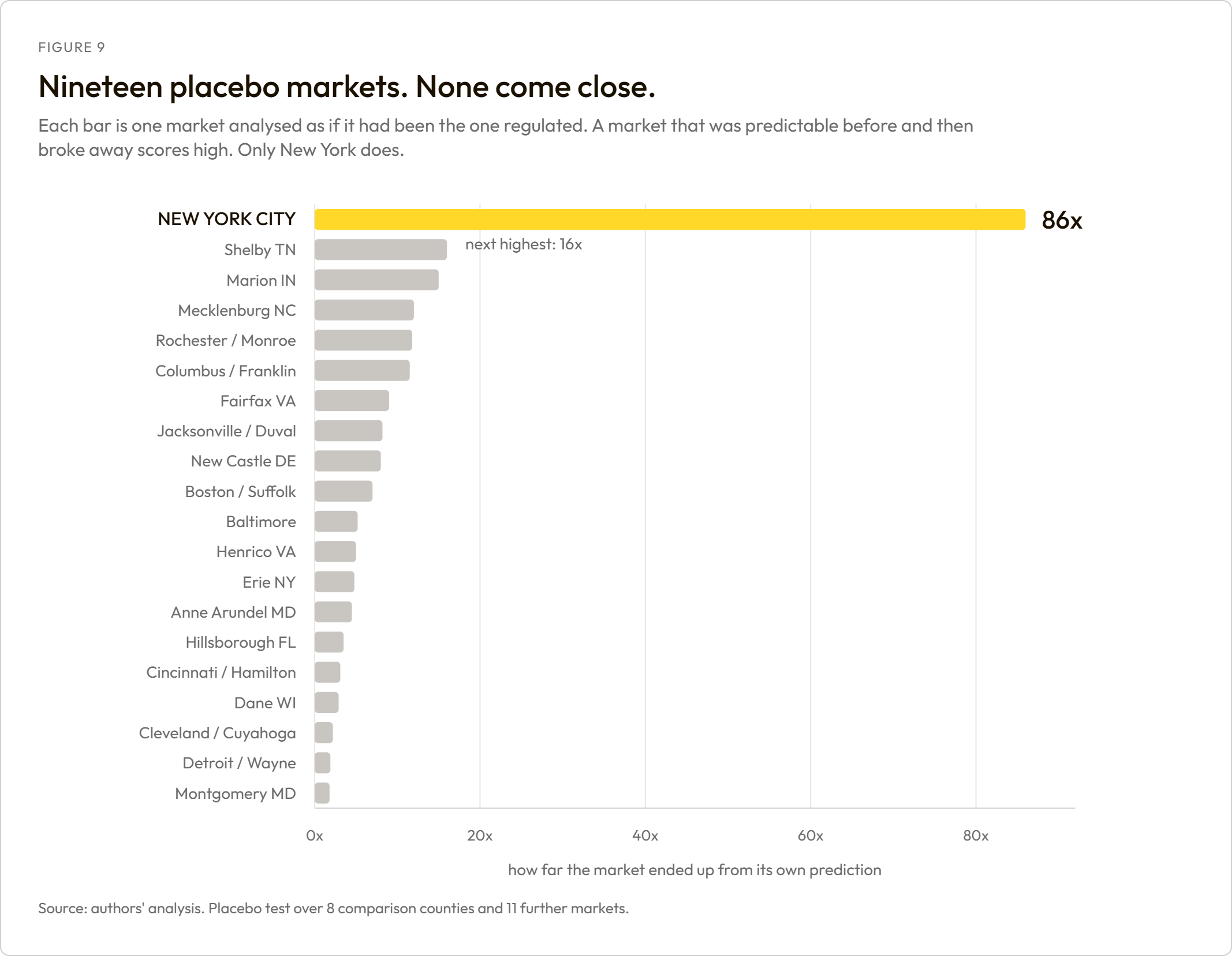
Leave-one-comparison-market-out. Removing each comparison market in turn moves the collapse estimate between -80.9% and -79.6%. No single market drives the result.
| Market removed | Collapse | 2024 | 2025 to 2026 |
|---|---|---|---|
| None | -80.7% | -78.6% | -78.7% |
| Boston / Suffolk | -80.7% | -78.4% | -78.5% |
| Baltimore | -80.9% | -78.8% | -79.0% |
| Detroit / Wayne | -80.8% | -78.5% | -78.7% |
| Cincinnati / Hamilton | -80.6% | -78.4% | -78.5% |
| Columbus / Franklin | -80.7% | -78.9% | -79.2% |
| Jacksonville / Duval | -80.6% | -78.5% | -78.7% |
| Rochester / Monroe | -79.6% | -77.1% | -77.9% |
| Cleveland / Cuyahoga | -80.6% | -78.3% | -78.5% |
Fake-treatment test, by outcome. Pretending the law arrived in January 2023 and re-running the analysis recovers 4.4% of the real effect on supply and 0.3% on booked nights, both of which pass. On price it recovers 61.1%, which fails. This is the same test that would have caught the error in several published claims about this law, which is why we ran it on ourselves.
Partial pooling. Neighbourhood-level estimates come from a Bayesian hierarchical negative-binomial model. Where a cell holds few listings, the model widens its interval rather than producing confident noise.
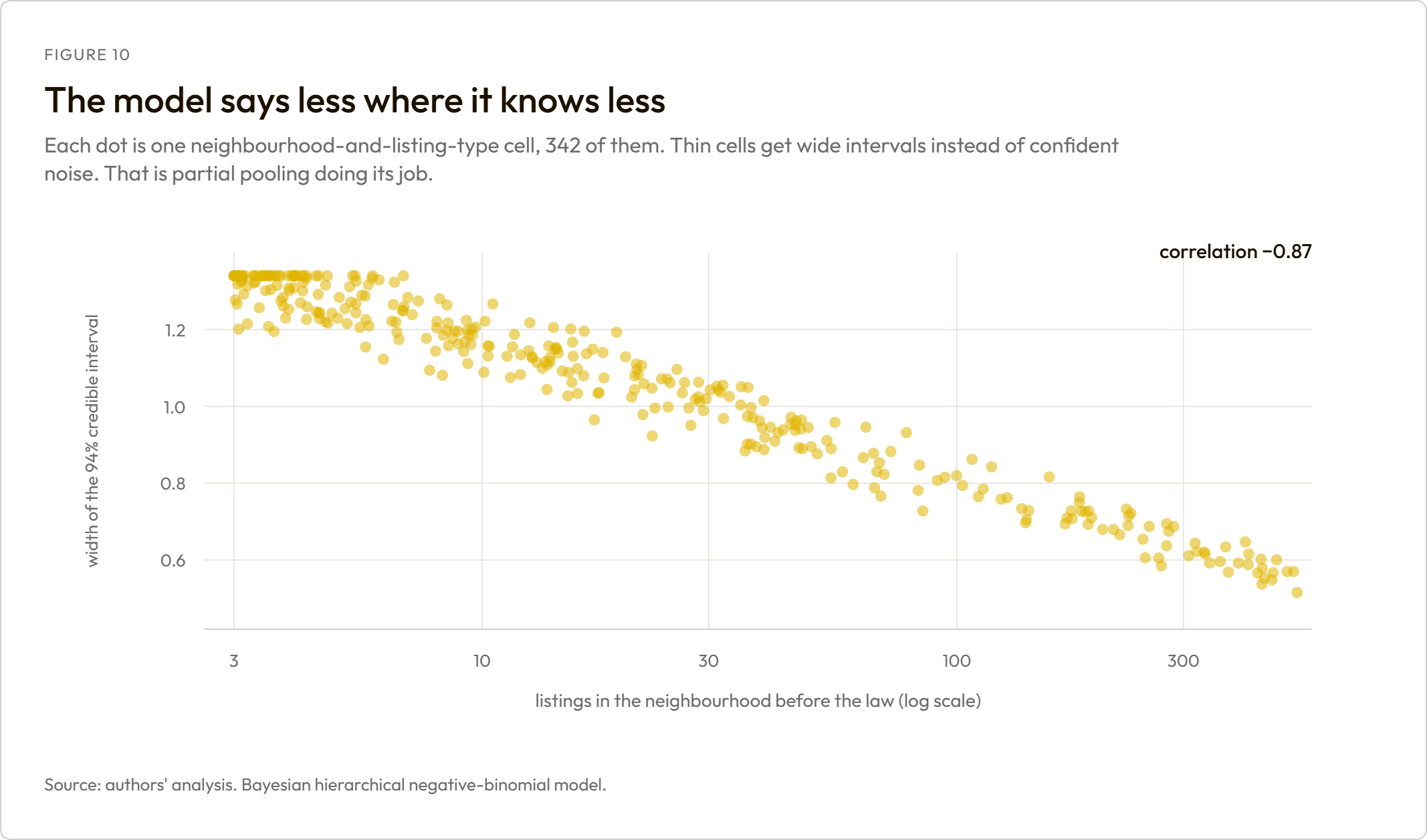
Convergence. Every model cleared its gate before any of its numbers were used.
| Model | Worst R-hat (want < 1.01) | Lowest effective sample | Divergences | Passed |
|---|---|---|---|---|
| es_booked | 1.0022 | 2,512 | 0 | Yes |
| es_price | 1.0049 | 987 | 0 | Yes |
| es_supply | 1.0055 | 2,001 | 0 | Yes |
| hier_borough_segment | 1.0038 | 1,417 | 0 | Yes |
| hier_nbhd_segment | 1.0074 | 527 | 0 | Yes |
| iv_citywide | 1.0006 | 8,240 | 0 | Yes |
| scm_supply | 1.0015 | 7,734 | 0 | Yes |
A10. Definitions that change how the numbers read
- "Short-stay supply" means listings bookable for under a month. A listing that switches to 30-night minimums leaves this measure, which is why we never describe the fall as units being removed from the market.
- "No longer visible" means not found in a public snapshot of Airbnb. It is not the same as gone from the market: the snapshot misses about 9% of listings we can independently see trading, roughly one disappearance in ten is temporary, and a listing that moved to another platform is invisible to us entirely.
- "Exempt" is a claim recorded against a listing, not a verified status. Every figure using it describes what hosts assert.
- Prices are asking rates, and only for listings that survived. They are not what the average pre-law host earns now.
- Intervals are 94% credible intervals from Bayesian models, not confidence intervals.
A11. What we hold no data on at all
Property sales, deeds, prices paid, owner identities, whether a listing is owner-occupied, and any activity on booking platforms other than Airbnb. No claim about who owns these properties, who bought them, or what happened to them off Airbnb can be supported by this analysis, in either direction.
A12. Known limitations
- The quantity series is censored by the law itself. A listing that converts to 30-night minimums leaves the supply series and the booked-nights series at the same moment, so the observed fall in nights mixes lost demand with conversion. This is why the diversion ratio is a lower bound and why we cannot recover a demand elasticity.
- The price design fails its own falsification test. We report the composition finding, which does not depend on it, and make no causal price claim.
- The largest block of the listing trace cannot be split. Conversion is a floor, disappearance is a ceiling, and no single "units removed" number is available.
- Exemption claims are unverified. Every exemption figure describes what hosts assert on their listings.
- Other platforms are invisible. We hold no Vrbo or Booking data, so "absent from Airbnb" is not "absent from the short-term rental market".
- One treated market. Conventional inference does not apply to a single city, which is why the placebo run over 19 markets stands in for it.
Sources for the competing published figures, in order of appearance in the report: Airbnb's two-year review of Local Law 18; AirDNA's one-year analysis; the Mayor's Office of Special Enforcement report of 3 September 2025; Anastasi, Marsella, Melo, Stephenson and Wagner, European Journal of Political Economy (2025); Int 0879-2026 as introduced. All effect estimates are our own.